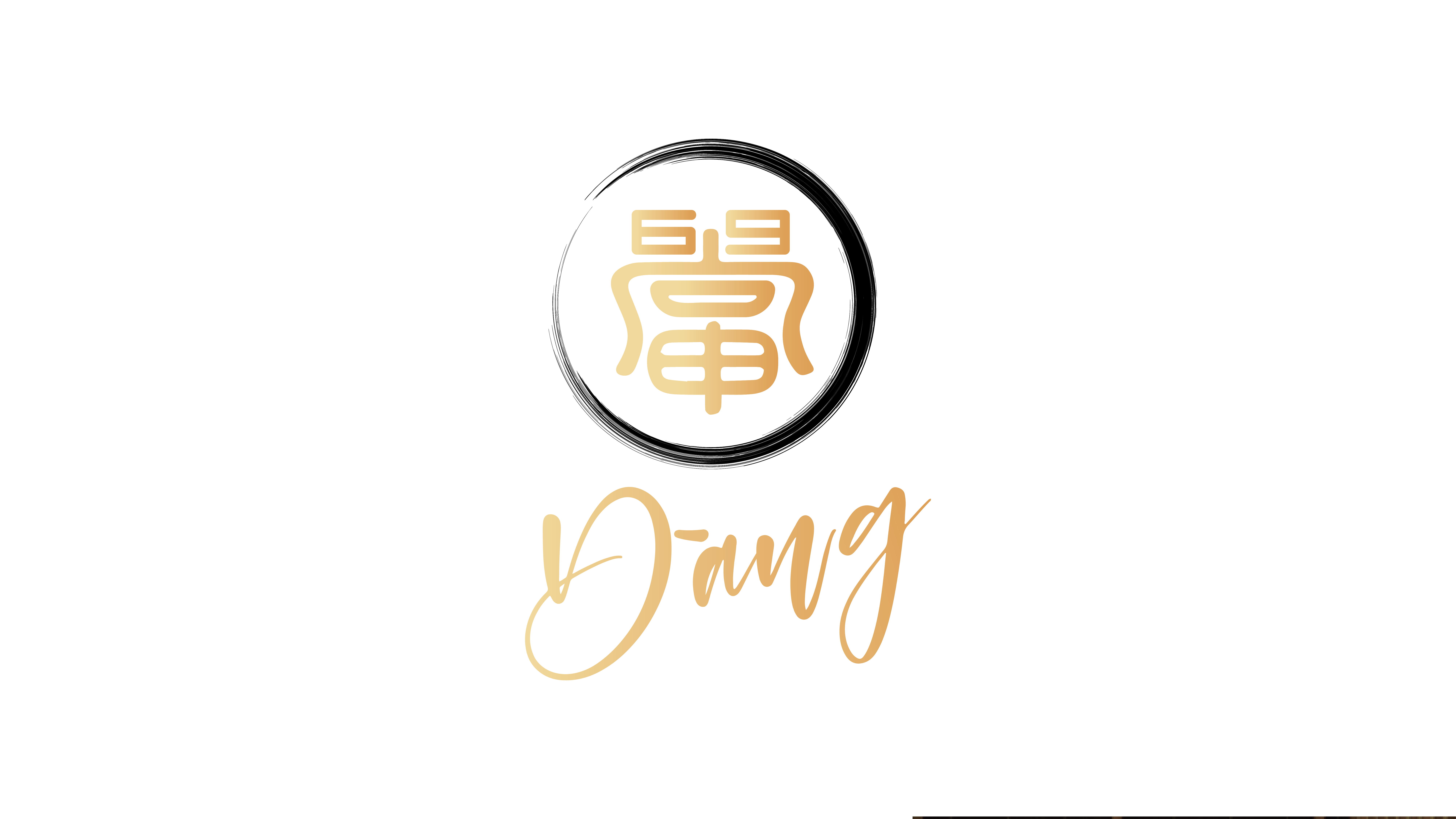
Dang
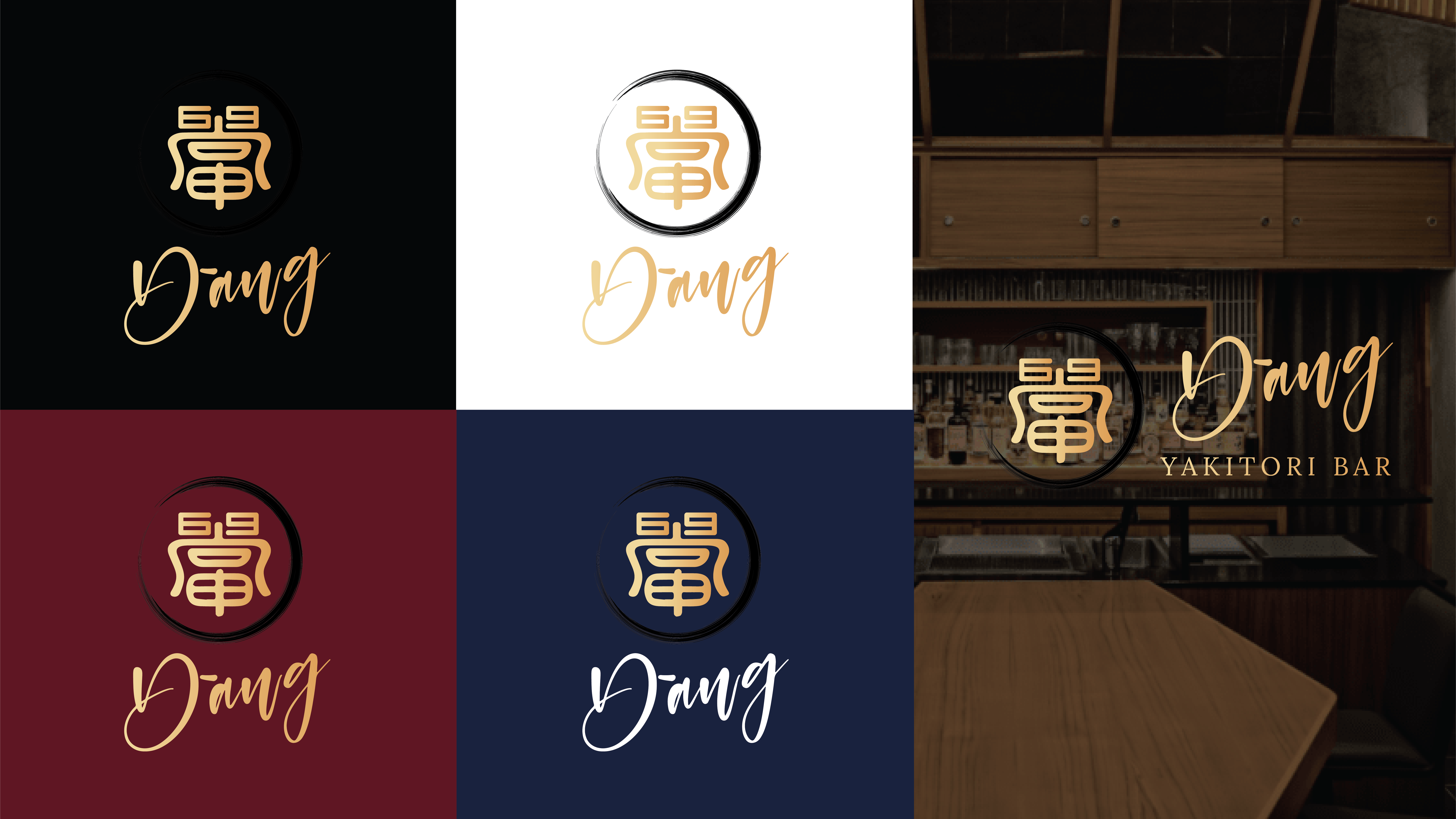
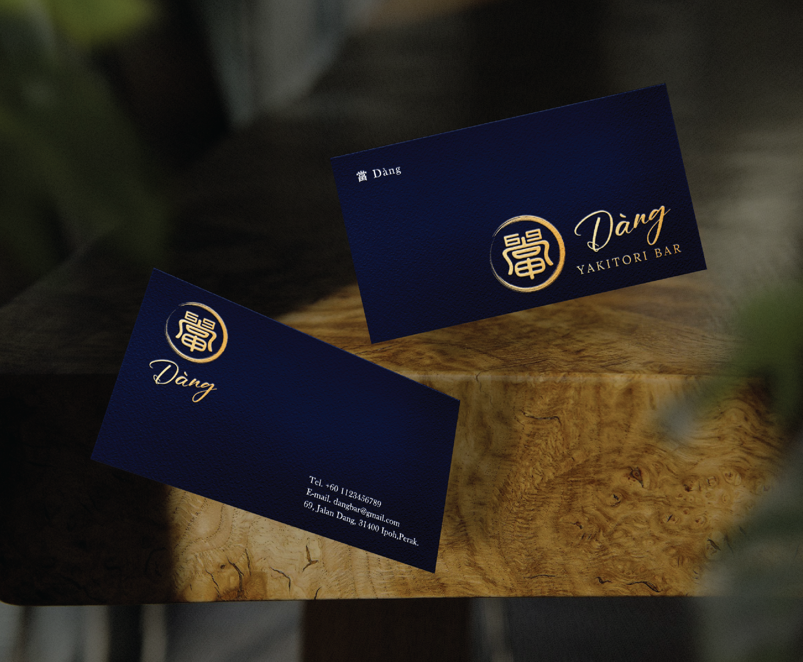
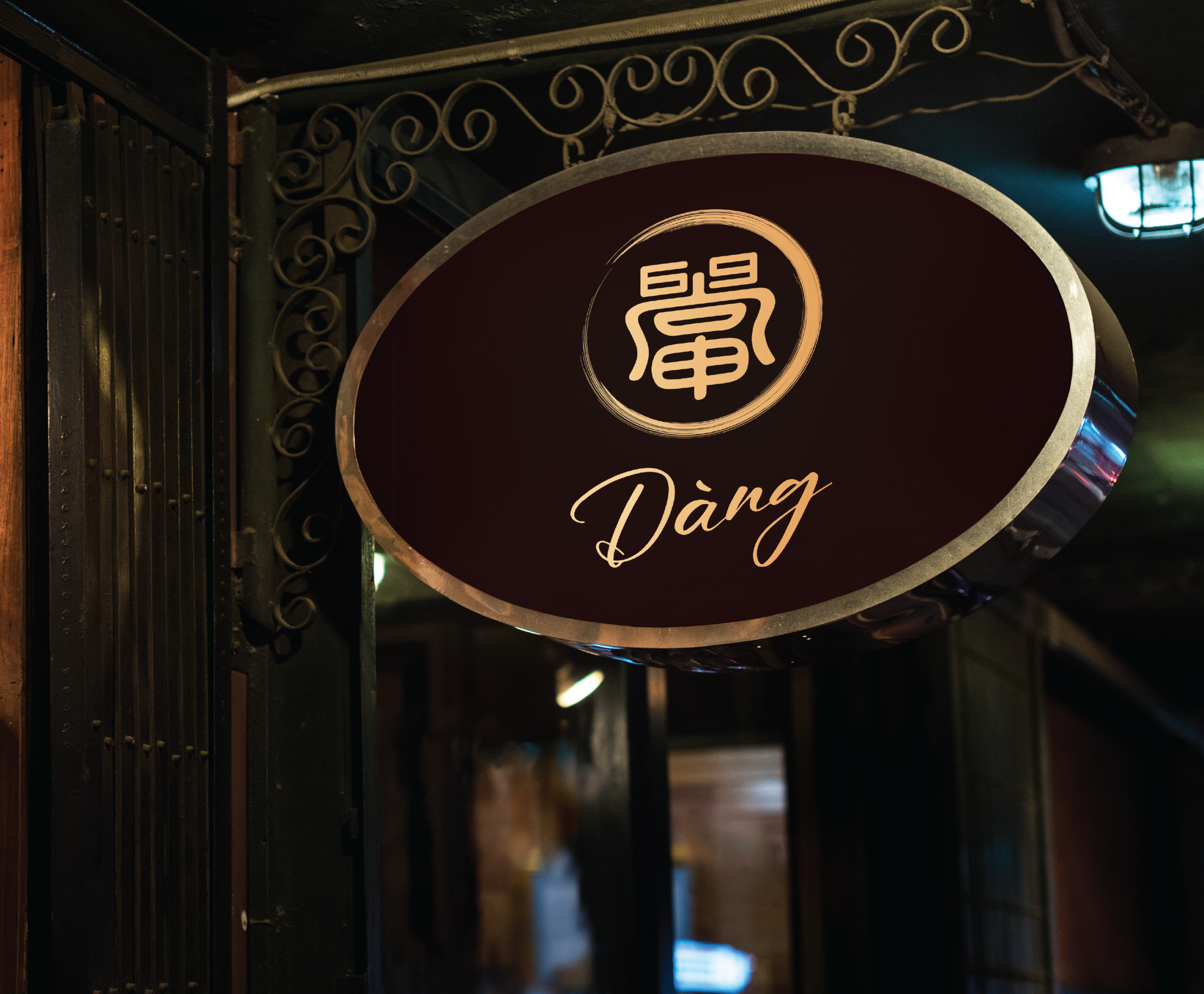
當 Dàng isn’t just any yakitori bar in Ipoh—it’s a hidden gem with a vintage-modern 70s/80s vibe, wrapped in gold and good times. We cooked up their logo and full brand identity to match their playful, chill yet classy atmosphere.
Objective:
To design a logo that feels vintage but modern, highlights their hidden-bar personality, and sneaks in their iconic door plate number “69.”
Concept:
We played with the Chinese character 「當」 using hieroglyph-inspired strokes for a nostalgic touch. Inside the “田” shape, we tucked in yakitori skewers (because what’s a bar without its grill?). The “69” is cleverly worked into the design, hinting at their door plate and adding that cheeky charm. To top it off, a cursive font keeps the whole look lively and modern.
Related Projects

Ready to Bring Your Ideas to Life
